

Inclusive design doesn’t have to be boring.
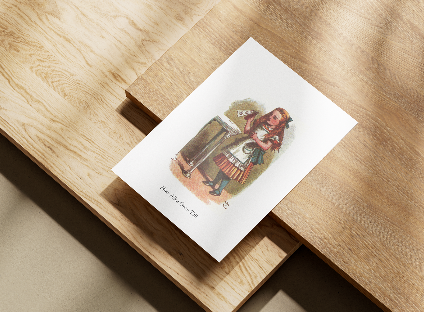
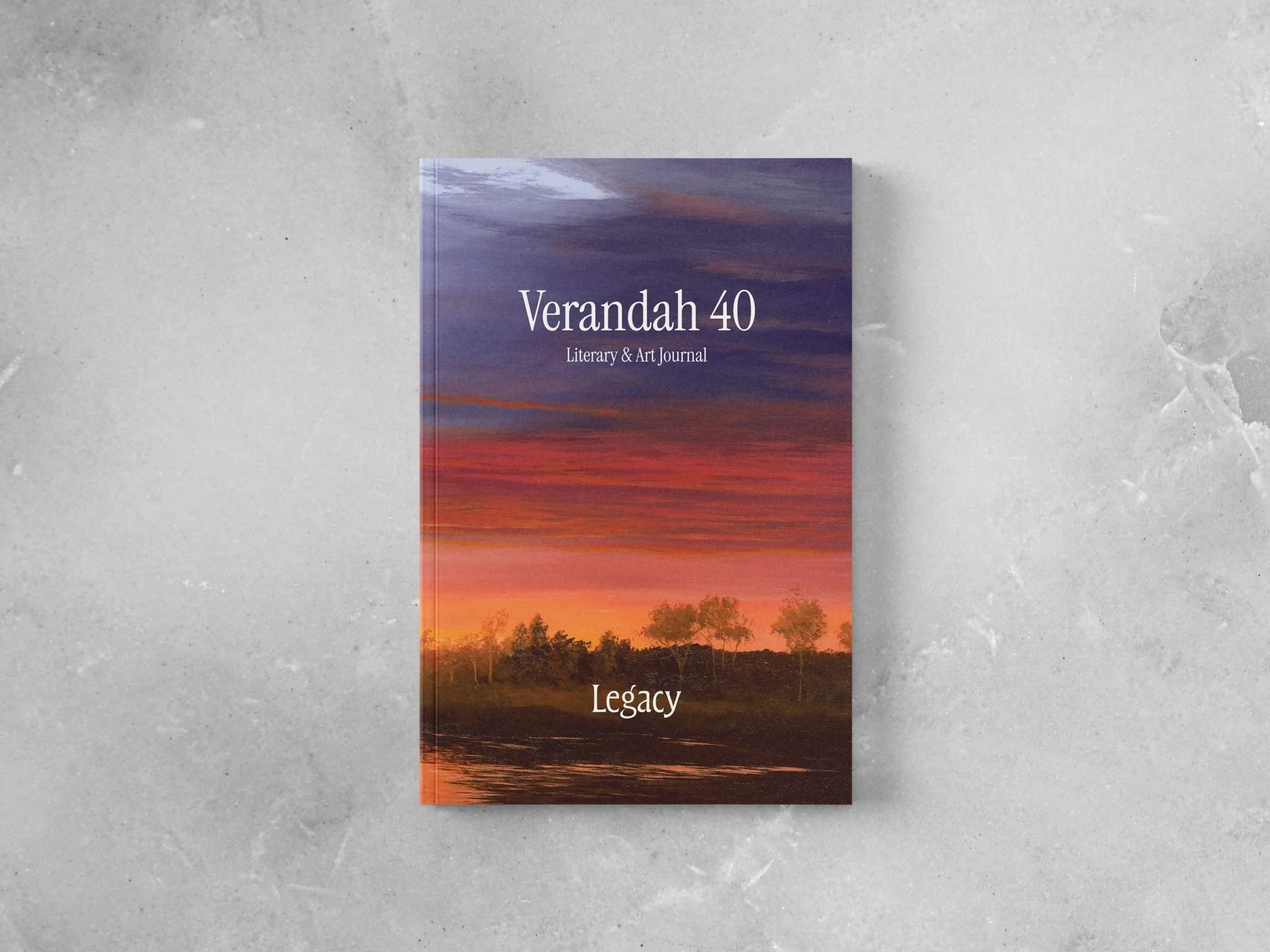
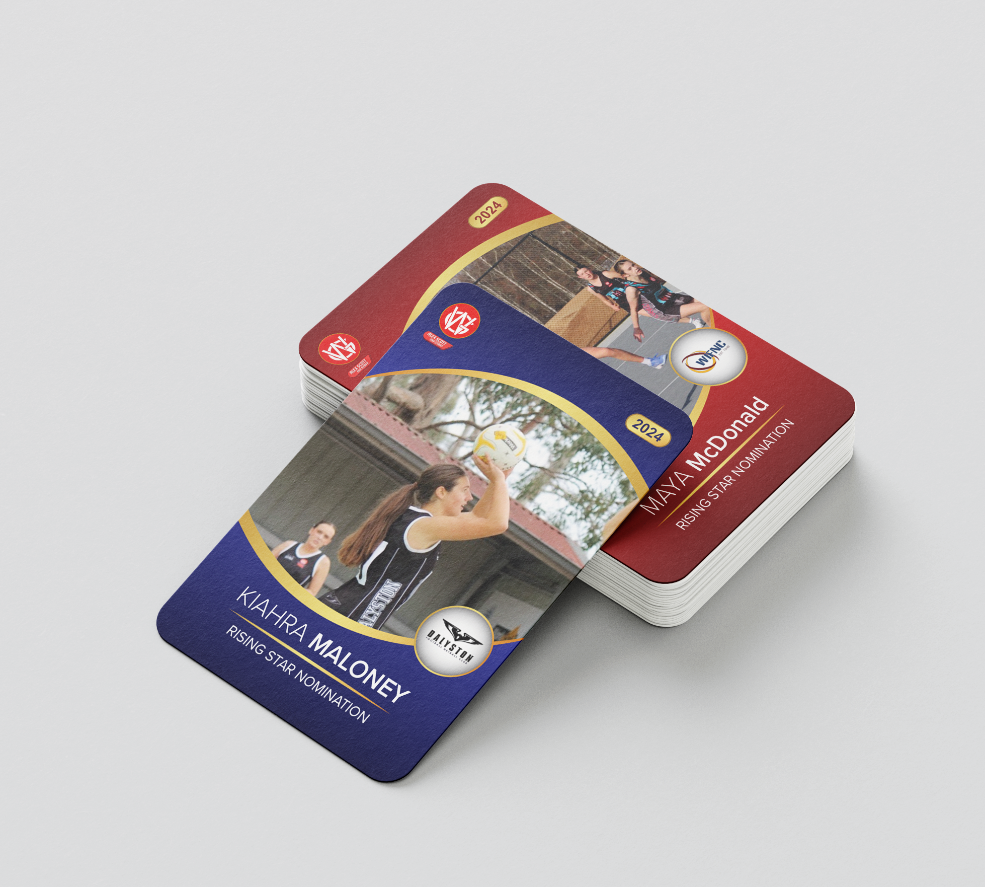
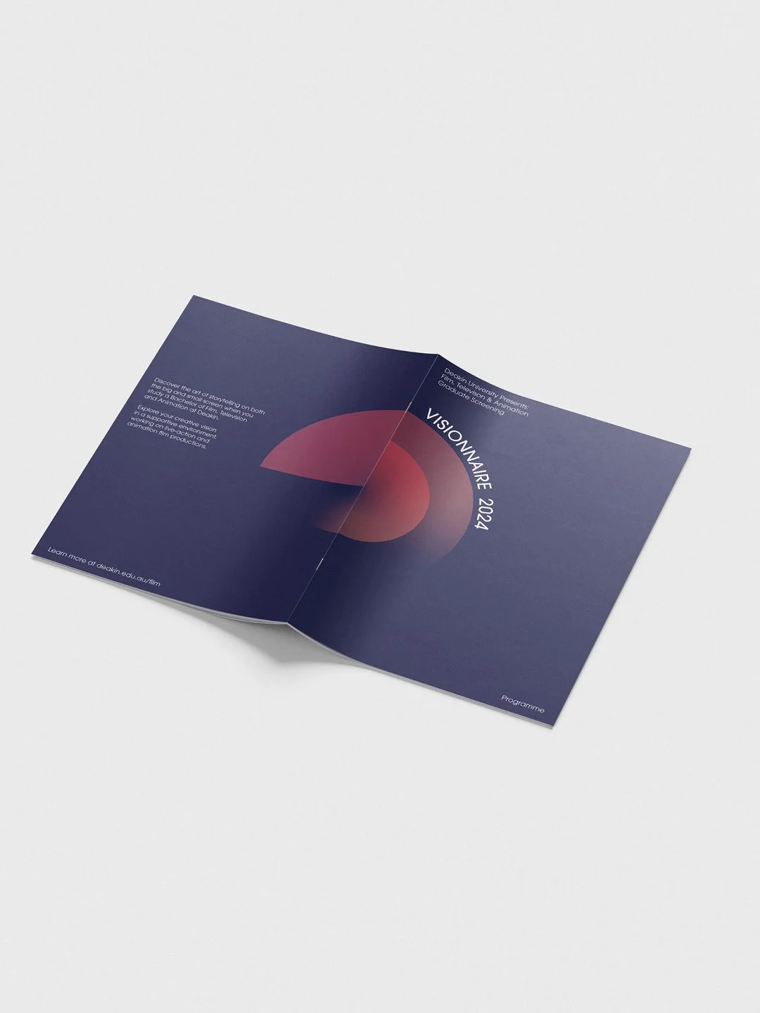
Recent projects

I care about how design affects people in real situations, when they’re tired, stressed, or simply trying to understand.
Busy layouts, heavy motion, and low contrast can make information harder to process, or engage with, especially for people with disabilities.
By using clear structure, considered typography, and thoughtful hierarchy, I aim to design in a way that ensures a comfortable experience.

People first design
Writing
Rethinking inclusion in design beyond visual accessibility. Exploring how participation, communication, and systems shape design outcomes.
Beyond ReadabilityExploring cognitive overload in communication design, and how clutter, attention capture, and overstimulation can reduce clarity and accessibility.
When Design OverwhelmsTestimonials
“Nate was a delight to work with. He created ideas that nailed the brief, and delivered exactly what we wanted before the deadline. I would highly recommend working with this consummate professional.”
— Deakin University
“Nate has been a pleasure to work with. He supported us through the creation of our brand guide. We have no hesitation in recommending Nate and will continue using his services into the future.”
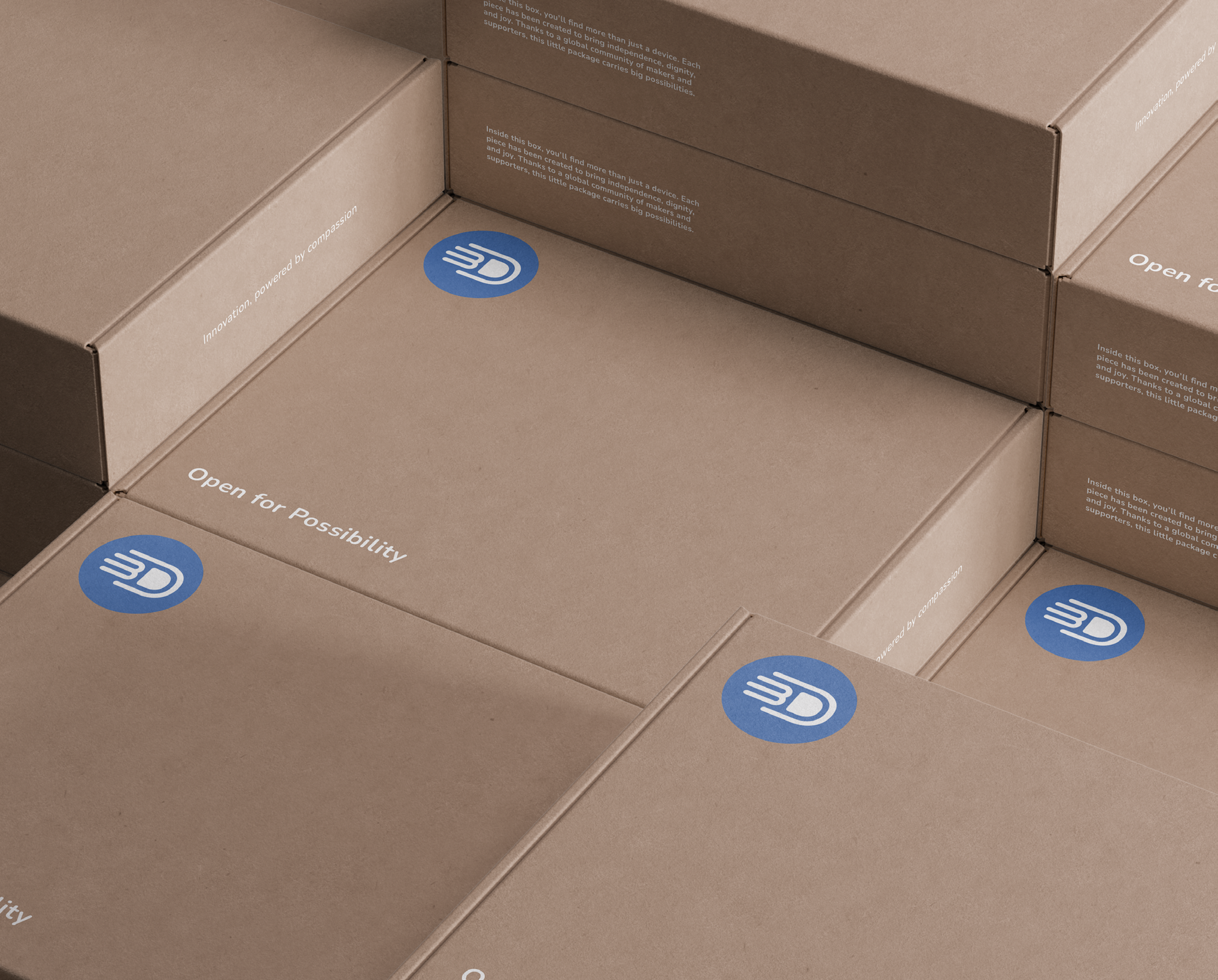
— Free 3D Hands
Get in touch
© 2025 Nate Tessari