

A communication design project exploring how calmer visual systems can reduce cognitive load and support more inclusive public experiences.
Lessnoise
The problemPublic environments have become increasingly overstimulating. Bright signage, motion graphics, advertising, and competing visual systems layer together to create a constant demand for attention. For many people, particularly neurodivergent communities this results in difficulty processing information, heightened stress, and a sense of being overwhelmed.
ConceptAn organisation focused on raising awareness of cognitive overload, supporting neurodivergent communities and helping the public understand how overstimulation affects everyday experiences. LessNoise works across three connected points: public awareness advertising, a simple website that explains cognitive overload, and practical resources that help people manage everyday visual noise.
Design The LessNoise design system is built around Lexend Deca, a typeface developed to reduce visual crowding and support smoother, more accessible reading. Using one highly legible font across every touchpoint keeps the system predictable and easy to process, lowering cognitive load through consistency. The project is intentionally text‑only, relying on spacing, alignment and restraint, ensuring that every message is delivered with clarity and without competing visual noise.
Awareness by disruption
LessNoise begins by interrupting the visual noise of advertising with calm, clarity‑driven messages. These pieces use the familiar formats of advertising: billboards, bus shelters, digital screens etc. but subvert them through stillness, white space and a conversational tone.
By gently disrupting overstimulation, they draw attention to how overwhelming public spaces can feel, particularly for neurodivergent communities.
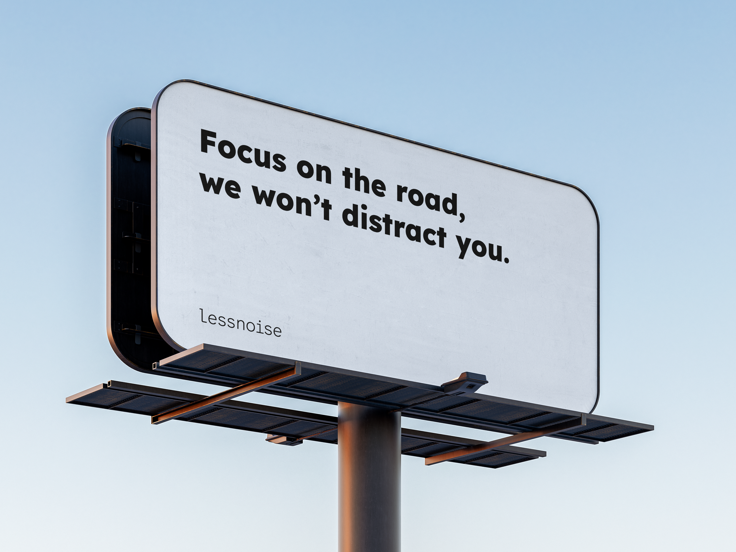
Highway billboardThe highway billboard uses simplicity as a form of interruption. A clean white background and a single conversational line creates a moment of clarity in a landscape dominated by messages trying to capture the attention of drivers and distract them. The design intentionally avoids colour, imagery or visual clutter, demonstrating how calm communication can coexist within high‑noise environments.
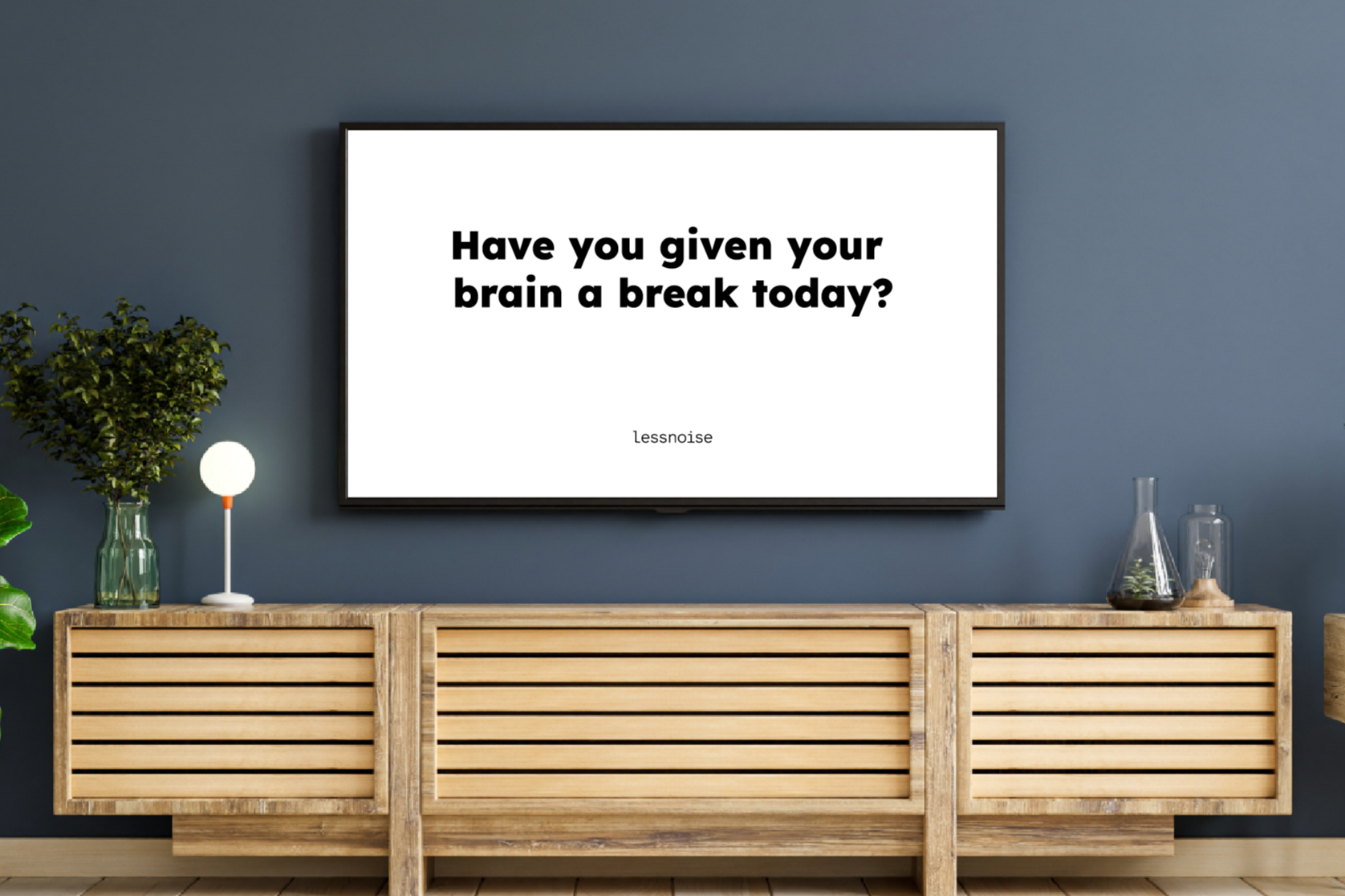
Television AdOne of the key awareness outputs is a silent television ad designed to act as a moment of calm between the chaos of regular programming. Instead of flashing lights, fast cuts or loud music, the screen remains still and quiet, showing text on a white background. The absence of movement captures attention in a different way by offering a pause. This disruption highlights how overstimulating media has become and invites viewers to notice a break from the cognitive load they experience without realising it.
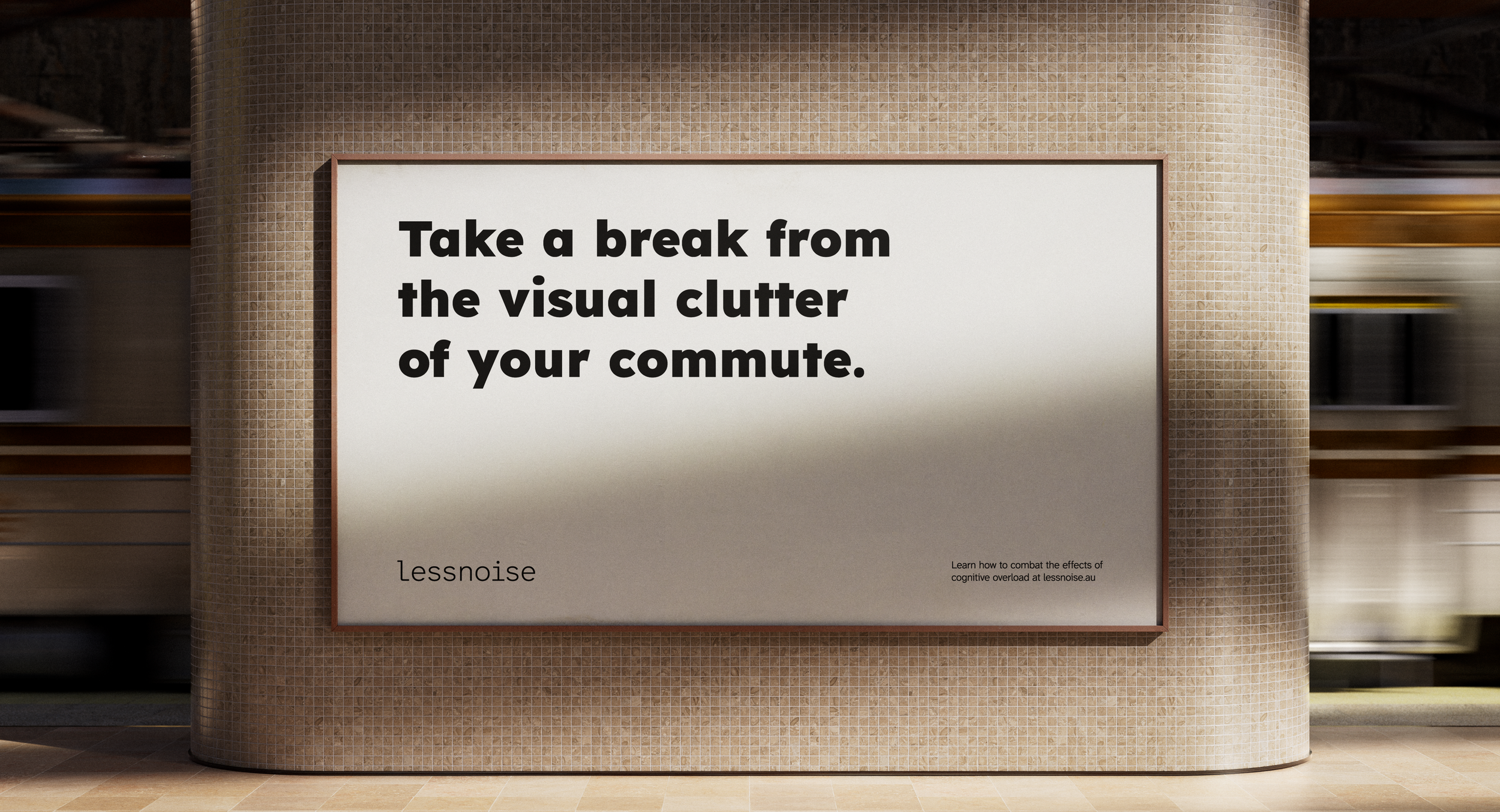
Train station postersTrain stations are layered with movement, announcements, signage, advertising and crowds. The poster creates a quiet interruption within that environment, using simple language and white space to offer a moment of clarity during the commute.
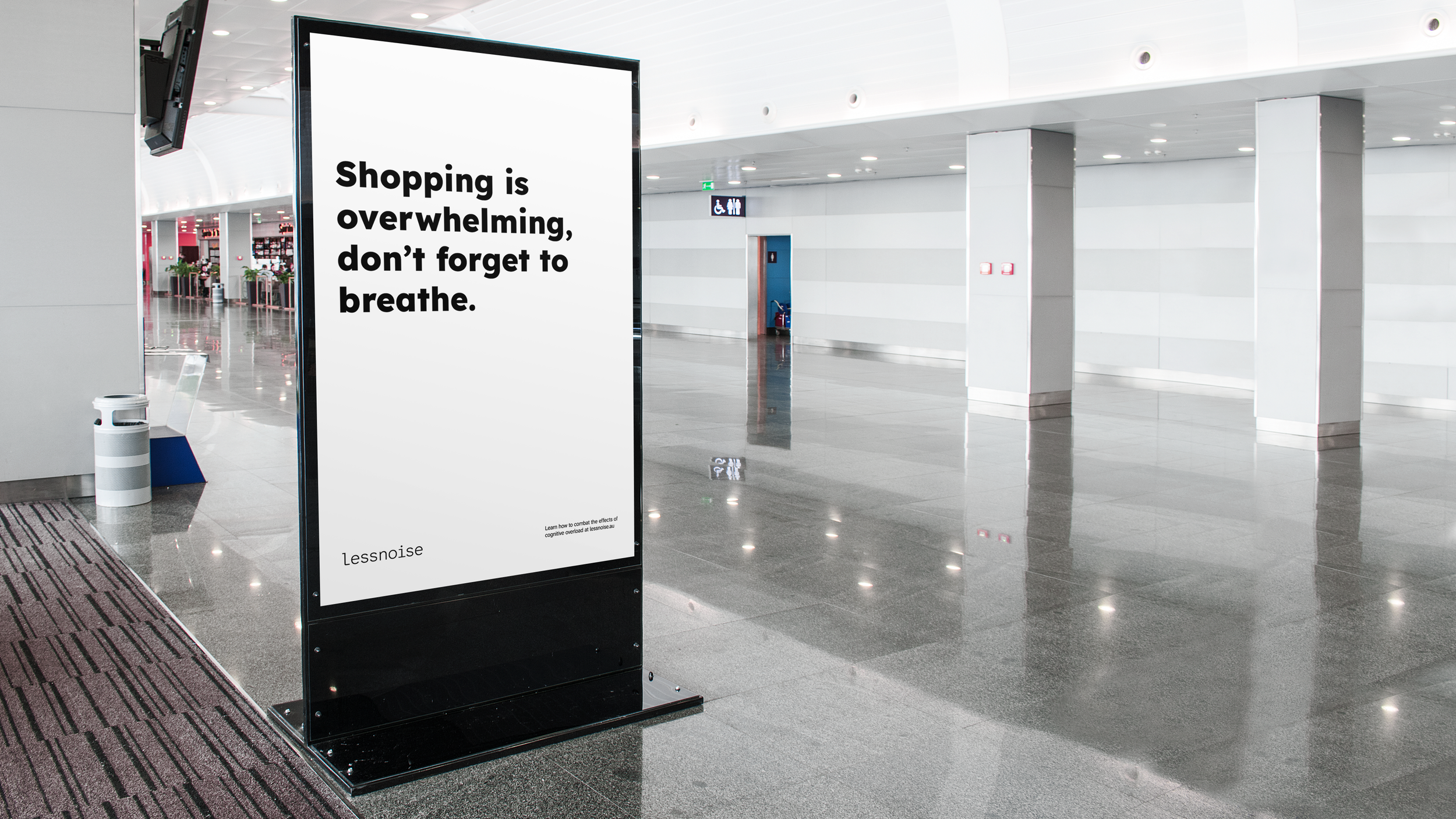
Media standShopping centres are visually and emotionally demanding spaces, with bright retail signage, movement, crowds and constant advertising. The media stand uses a calm message to acknowledge that shopping can feel overwhelming and offers a small reminder to pause.
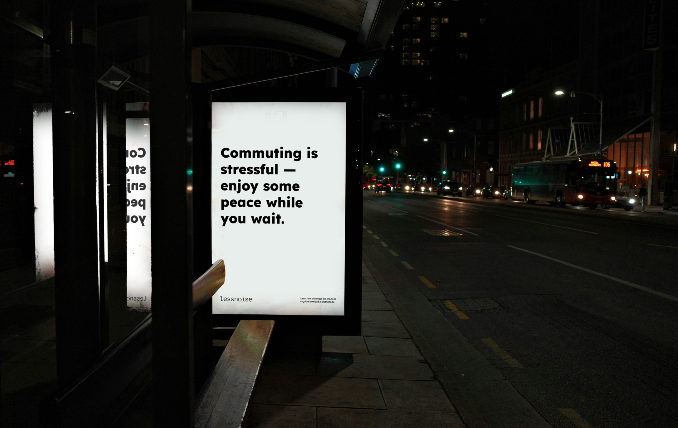
Bus stop posterThe bus stop poster uses the pause of waiting as an opportunity to create calm. Positioned in a space where people are surrounded by traffic, signage and advertising, the message offers a small moment of stillness during a daily routine.
Resources
The final part of the system focuses on education. Giving people simple, accessible tools that help them understand cognitive overload and support calmer everyday experiences.
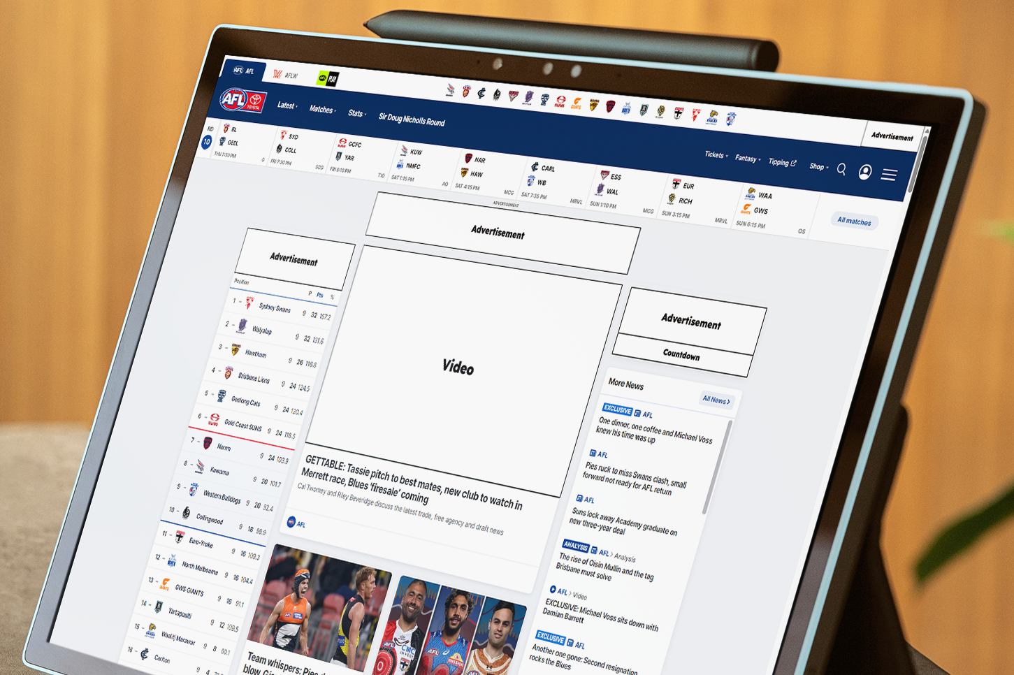
Browser ExtensionTo help people navigate digital spaces, LessNoise includes a browser extension that replaces overstimulating elements with calm, descriptive text. Instead of flashing banners, autoplaying videos or animated ads, users see labels such as: Advertisement, flashing lights, video etc.
By stripping visual noise back to its functional description, the extension demonstrates how much cognitive load digital environments place on users. It acts as a protective barrier for people that allows them to consent to the visual effects rather than be bombarded as soon as a webpage opens.
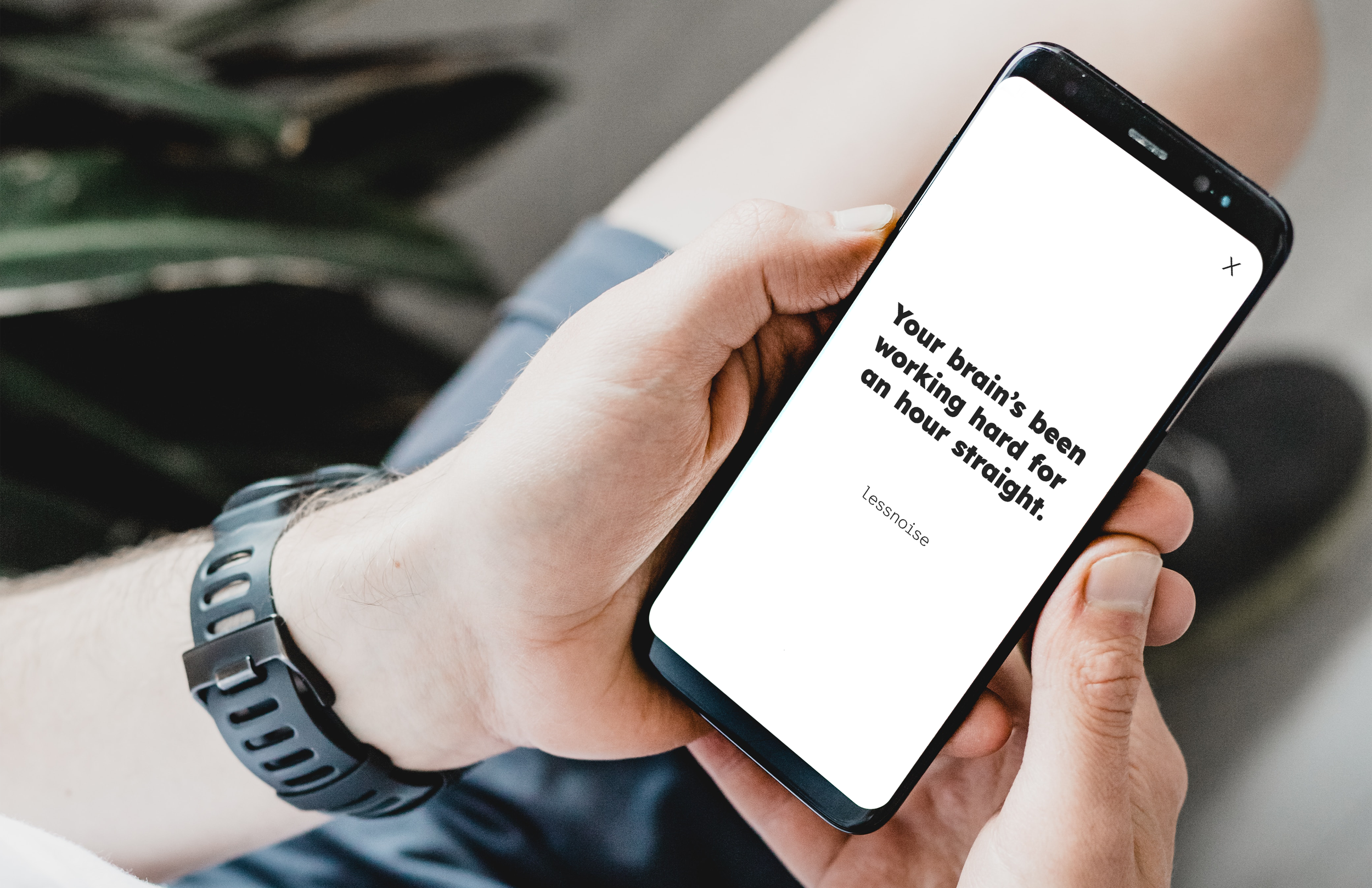
Break timerA quiet reminder that after sixty uninterrupted minutes of staring at a screen, your brain deserves a pause. Once an hour, the screen shifts to a still white background with a single line of text, offering a moment of calm reflection.

Designer focused posters A set of posters aimed at designers, offering subtle reminders about clarity, legibility and cognitive load. Each piece communicating a key principle of accessible communication into a statement into prompt reflection
Outcome
LessNoise demonstrates how restraint can become an active communication strategy. Rather than competing for attention, the campaign uses calm, text-led interventions to make cognitive overload visible across public, broadcast and digital environments.
© 2025 Nate Tessari